This data chart was my final project for the 2021 summer program I attended
at the University of Massachusetts Amherst, "Creative Coding and Data Visualization". The course was taught through the coding software Processing, and it was my first time
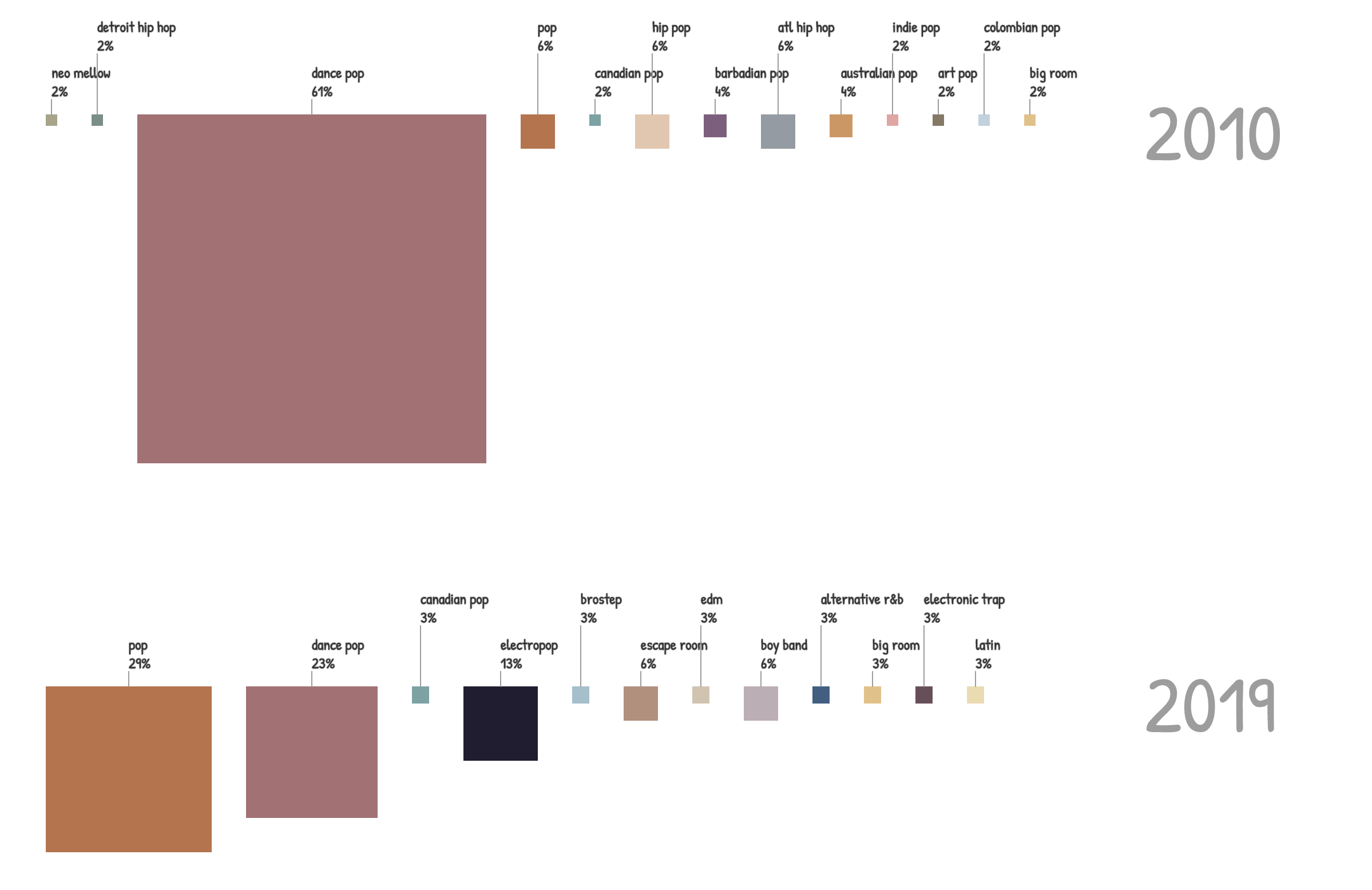
using Java. My program uses the top Spotify songs from 2010 and 2019 and finds the music genre of each song. It counts how many times each genre appears (for both years) and turns the counts into percentages.
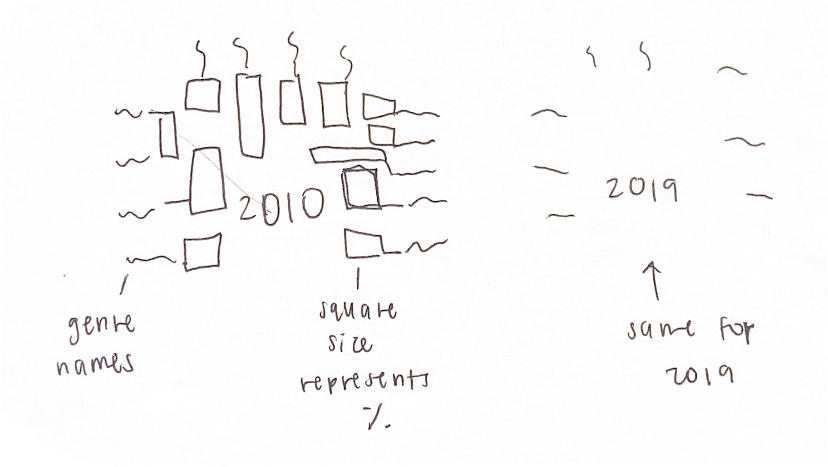
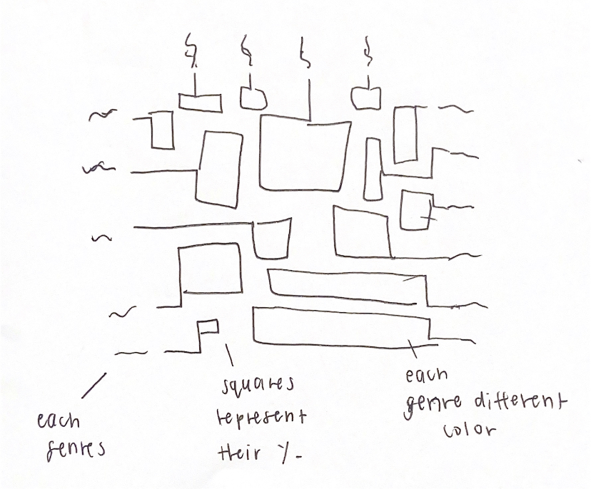
The squares' size represents the percentage and each different color represents a different genre. It should show how Spotify users' music tastes have slightly changed over some time.
I originally had more complicated designs in mind for this project, but I decided to start off simple.
I also wanted to make the percentages interactive (so when you hover over a square you can see the %), and have the genre labels align vertically w/ their corresponding squares,
but time did not allow me to accomplish those tasks. Through creating this data visualization, I greatly improved my skills in utilizing arrays, loops, and functions.